End-to-end product design for a rural experience platform
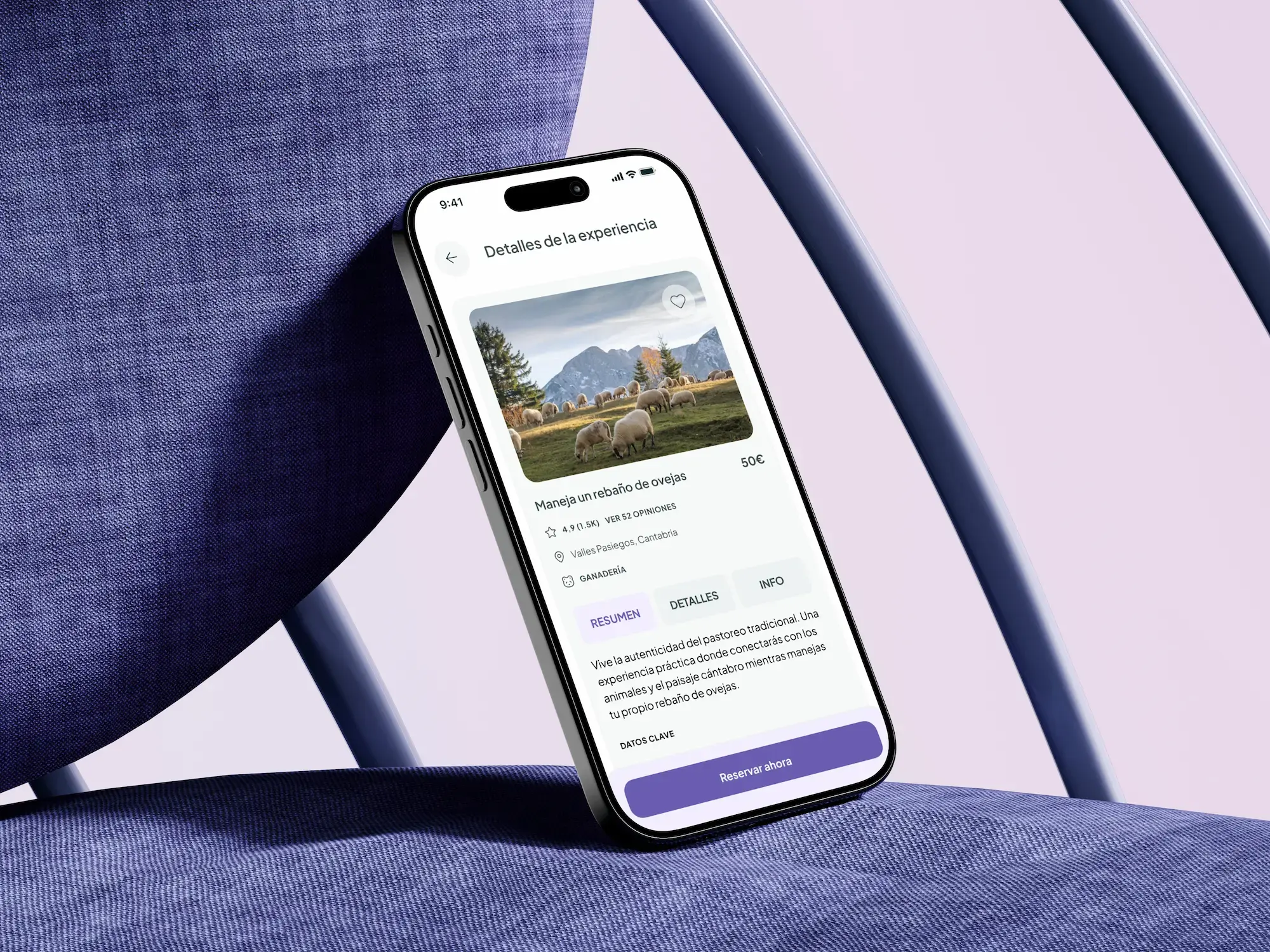
Impact: 213 token inconsistencies audited & fixed
Stack
- Figma
- FigJam
- Notion
- Figma Tokens
Project overview
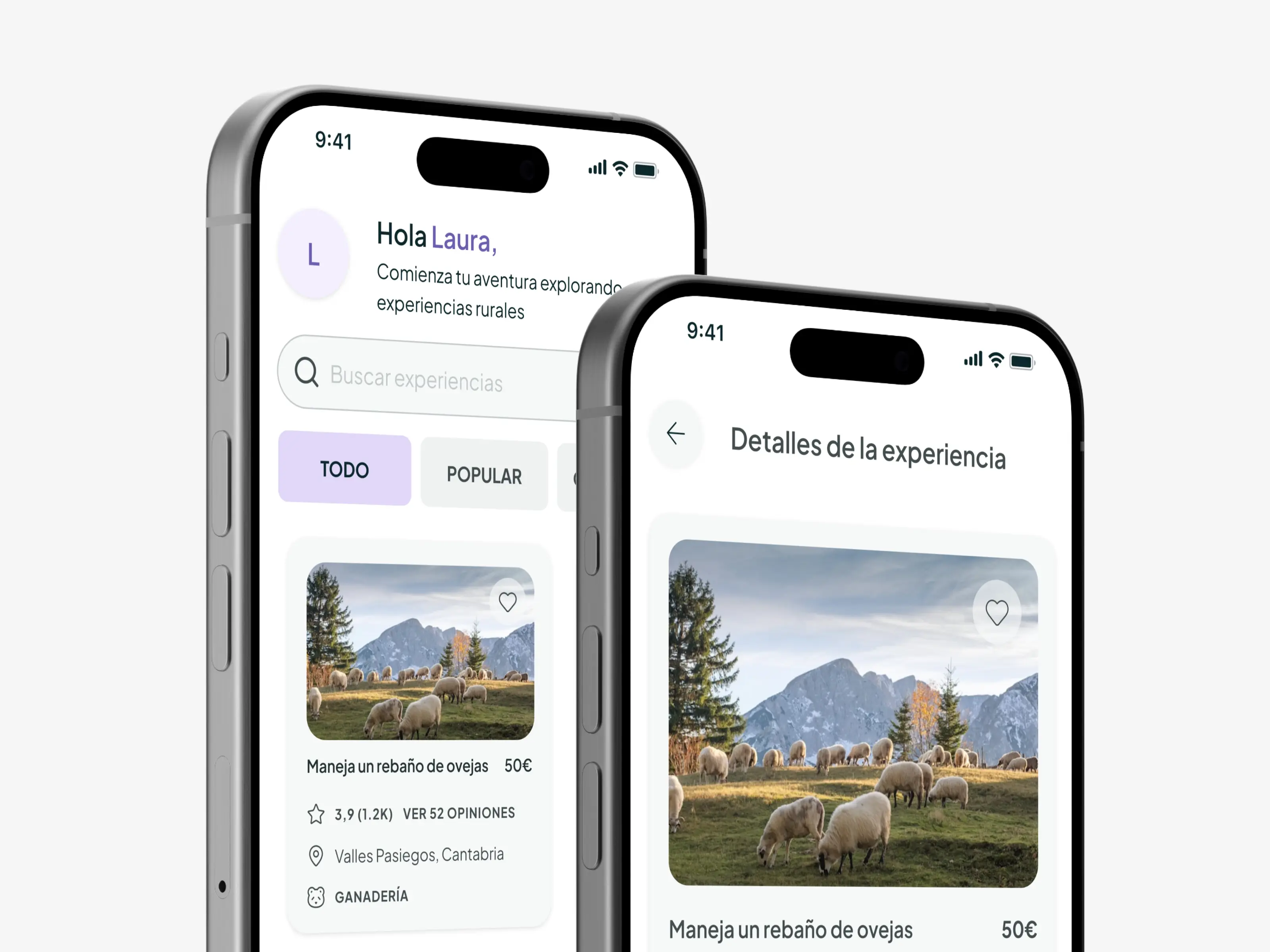
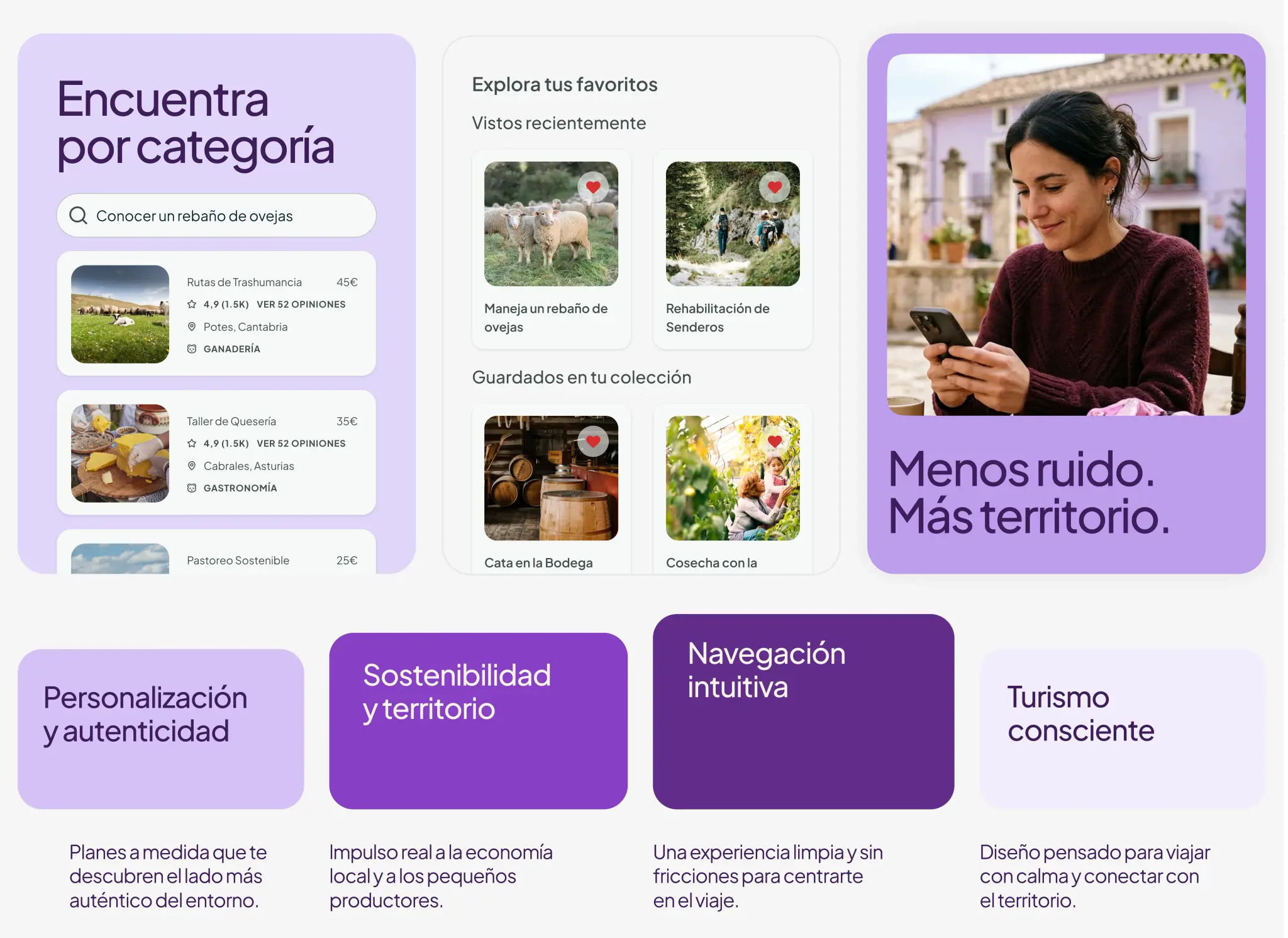
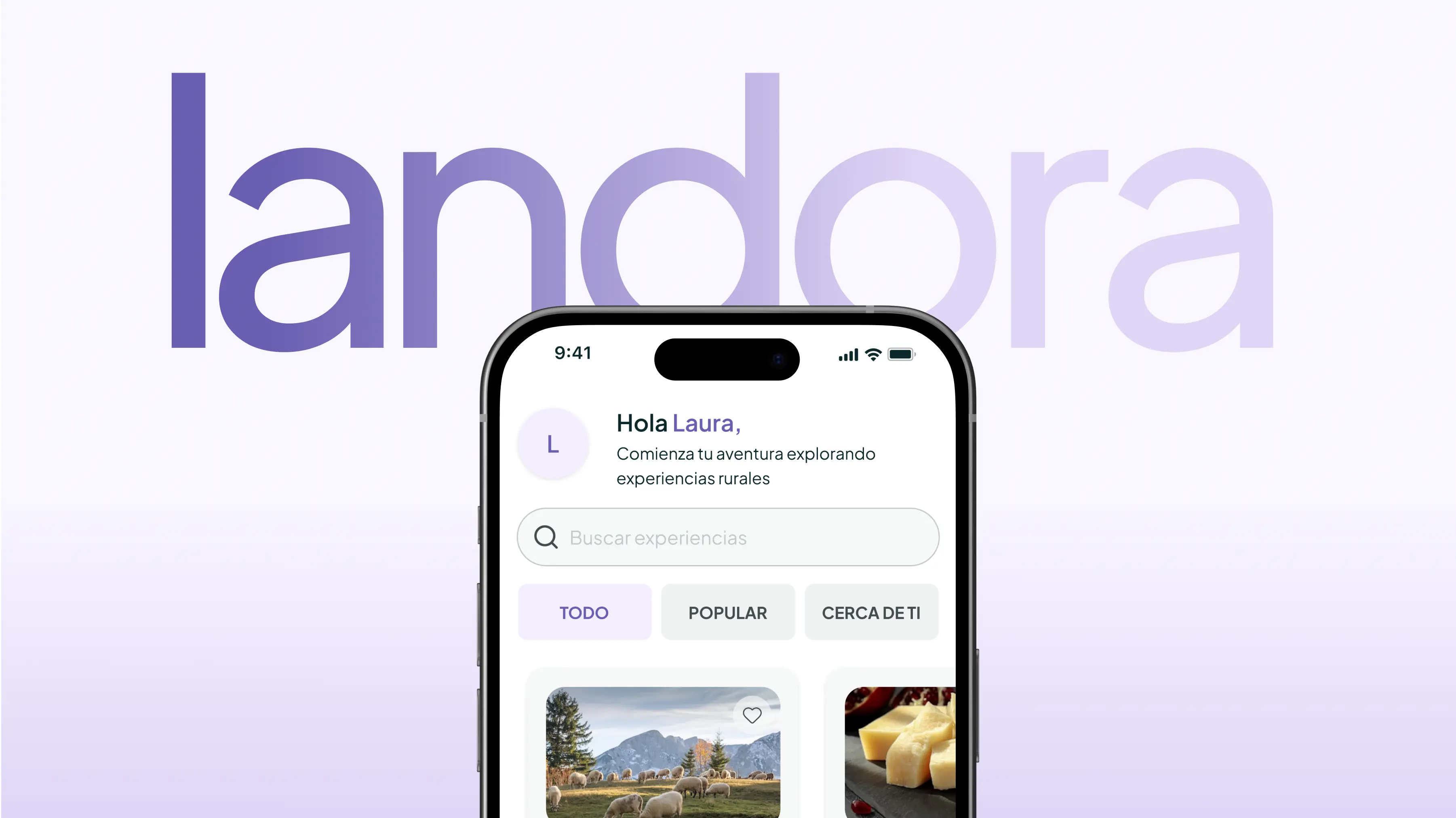
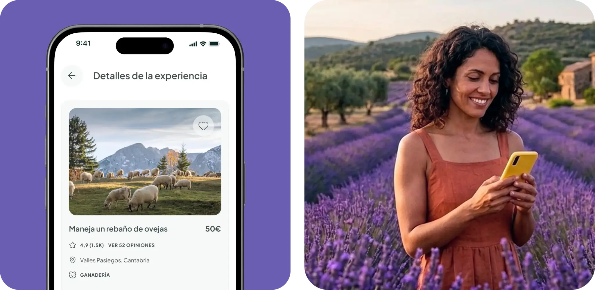
Rural experiences in Spain exist but are scattered and difficult to find or book. Current platforms fail to combine good UX with a rural focus and local community support, and the booking process is often confusing and visual information is scarce. Landora centralizes the discovery and booking of rural experiences (cultural, gastronomic, and natural) in a simple, accessible way that supports local communities.
Challenge
Rural areas are depopulating while cities face mass tourism, and there is a high demand for unique experiences but no centralized platform to host them. The booking process in existing options is often confusing, outdated, or incomplete. Users find themselves searching multiple sites without finding a unified solution.
My Role · Product Design & Design System · Solo, end-to-end: research, IA, UI design, accessibility (WCAG AA), dev handoff.
Objectives
Product Objectives
- Increase booking conversion rates.
- Position Landora as a benchmark for rural tourism.
- Support local communities by connecting them with urban users.
- Scale the experience catalog by category.
User Objectives
- Book rural experiences quickly and without friction.
- Find verified experiences with reliable visual information.
- Discover experiences on a single platform without cross-searching.
- Trust the platform before committing to payment.
1. Research
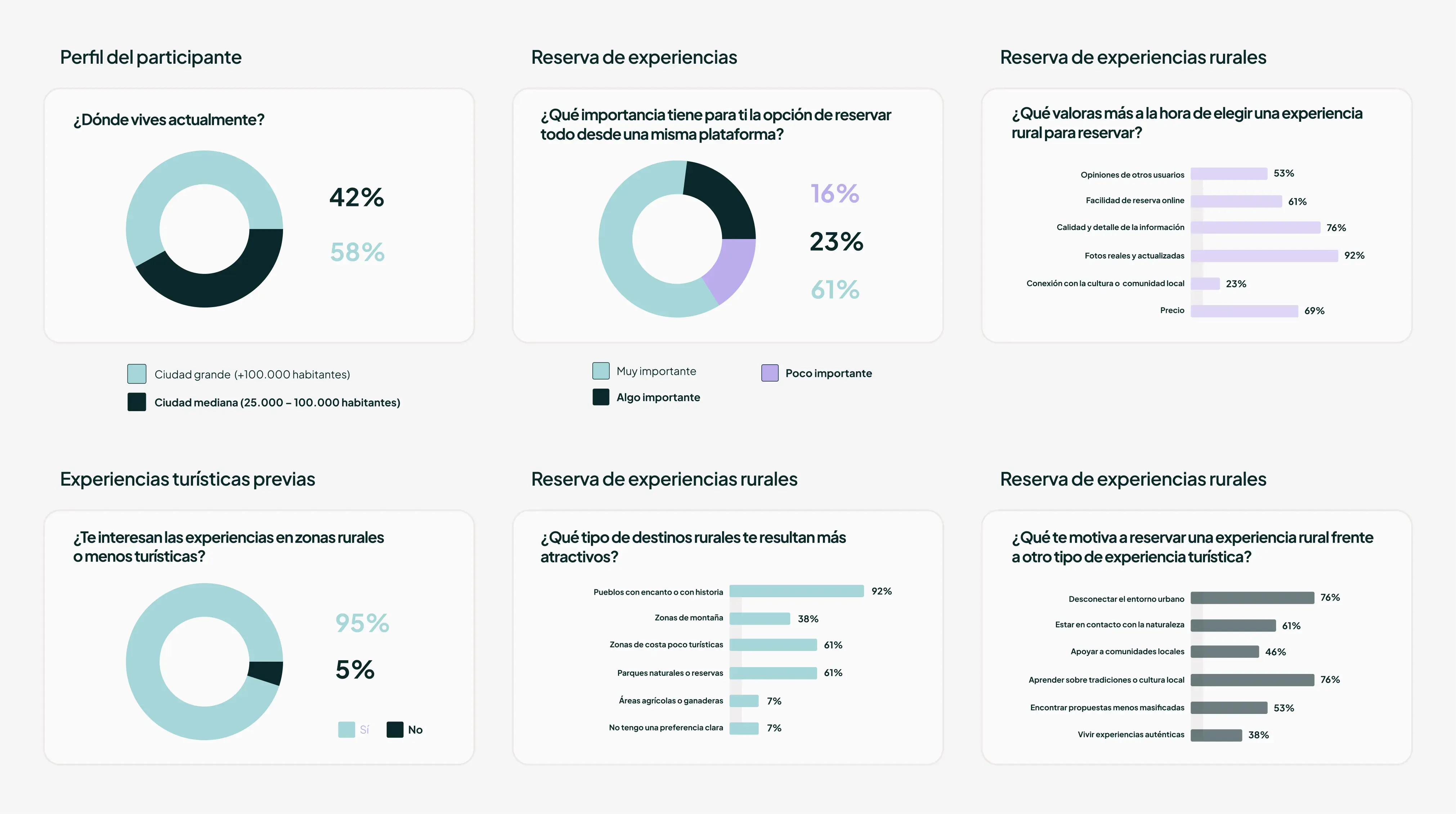
Five in-depth audio interviews were conducted, with full transcription and analysis, with participants aged between 25 and 60 from diverse backgrounds. The questions covered general booking habits, barriers to rural experiences, previous experiences, and the "ideal app." This was supplemented by a Google Forms survey with approximately 20 responses from users with different profiles.
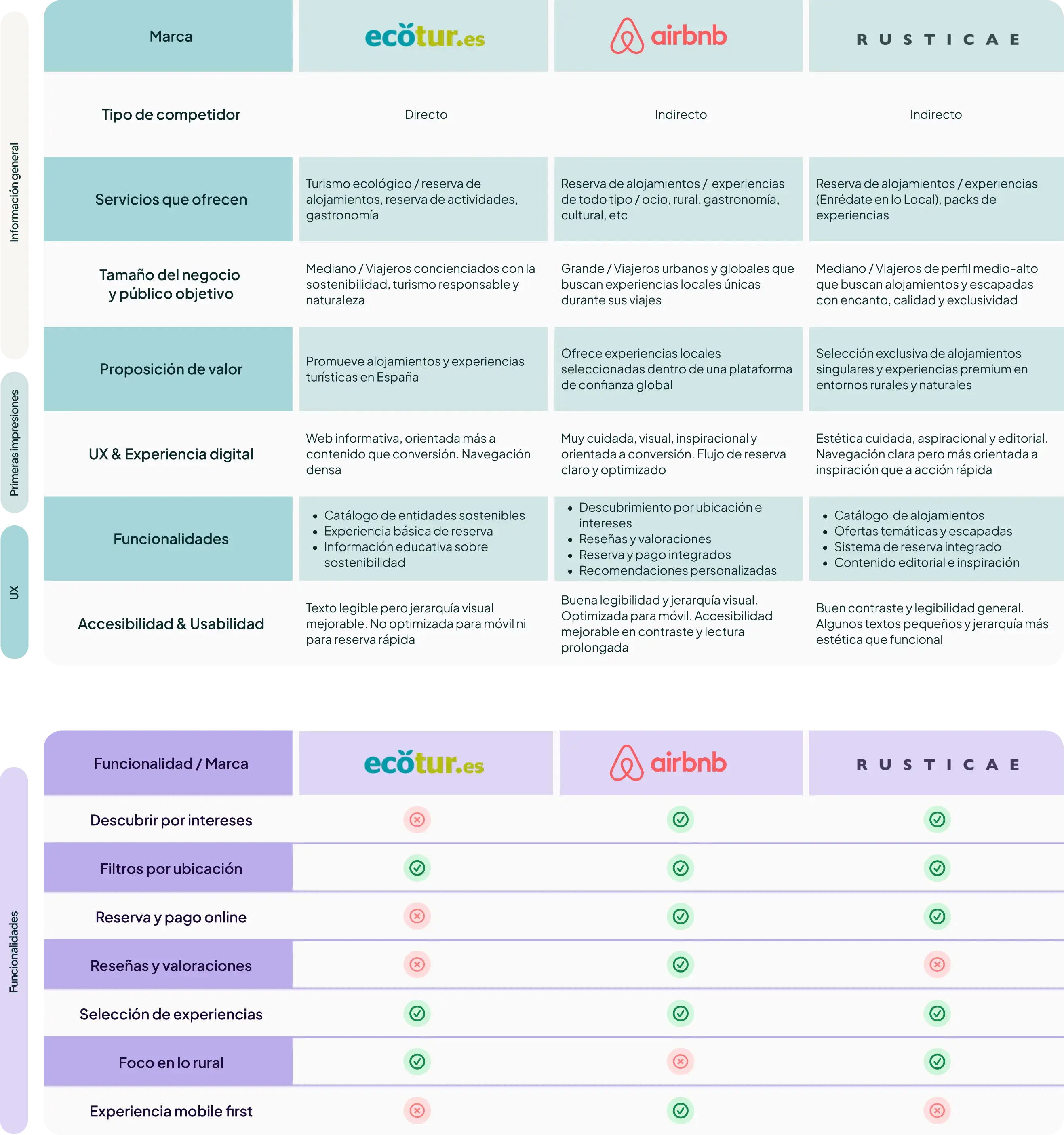
Landora's opportunity: high-quality UX + rural focus + support for the local community, all on one platform.
- Key insight: Booking Complexity
- Key insight: Visual Trust
- Key insight: Fragmented Search
| Platform | Strength | Weakness |
|---|---|---|
| Ecotur | Informative | Not geared towards direct bookings |
| Airbnb | Excellent UX and bookings | No rural focus or community impact |
| Rusticae | Quality editorial selection | Exclusive focus, no community value |
2. Definition
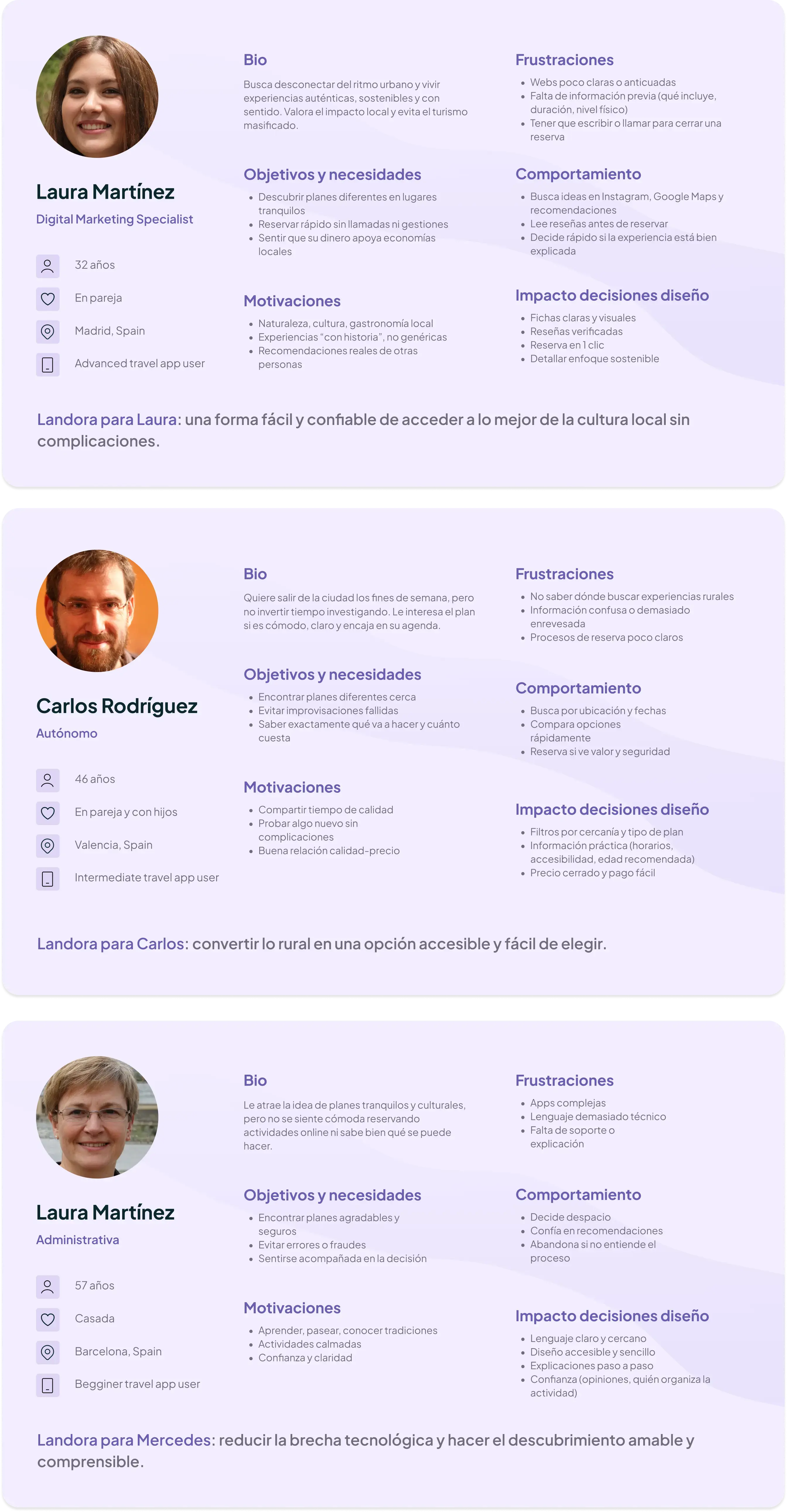
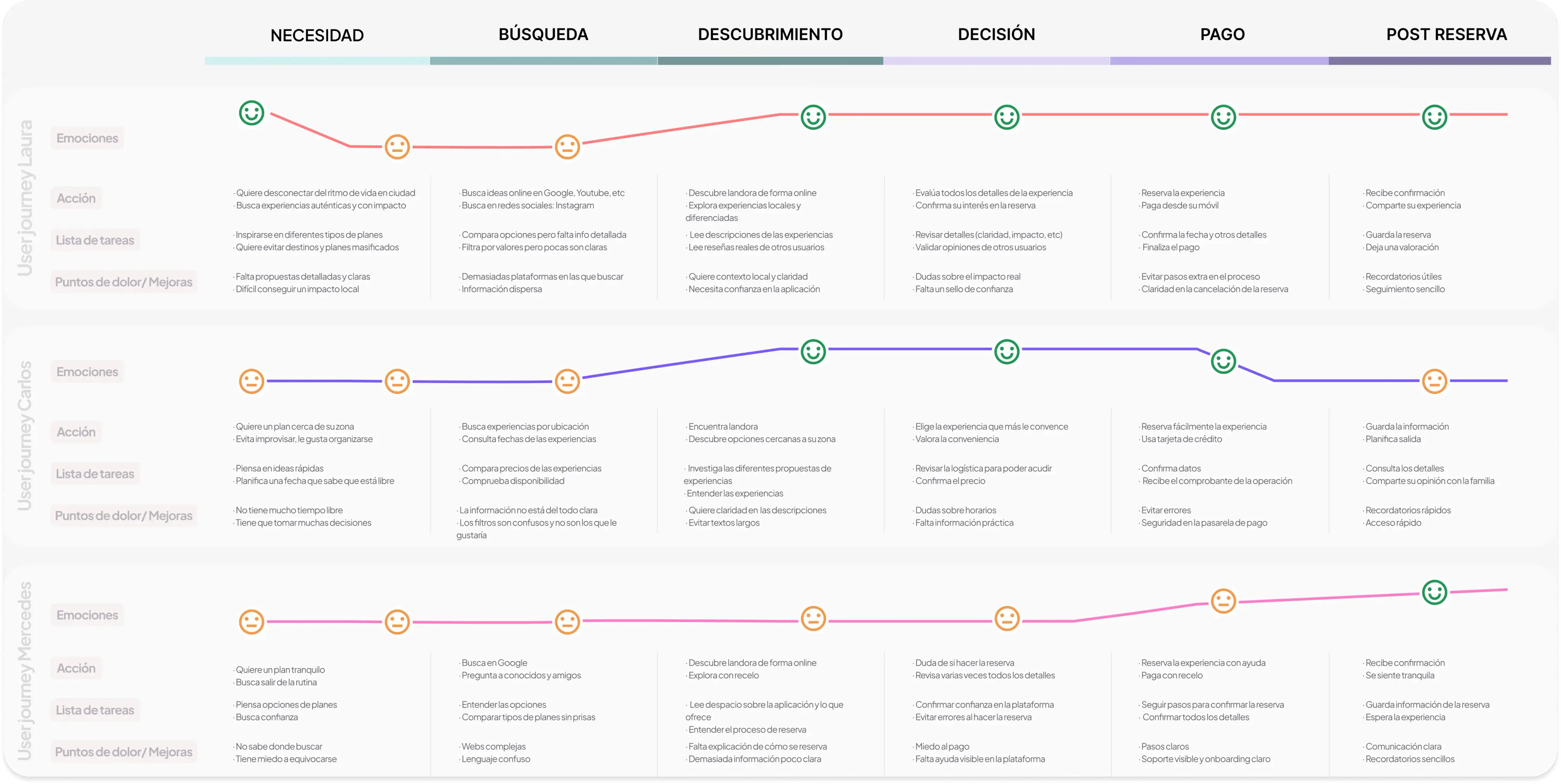
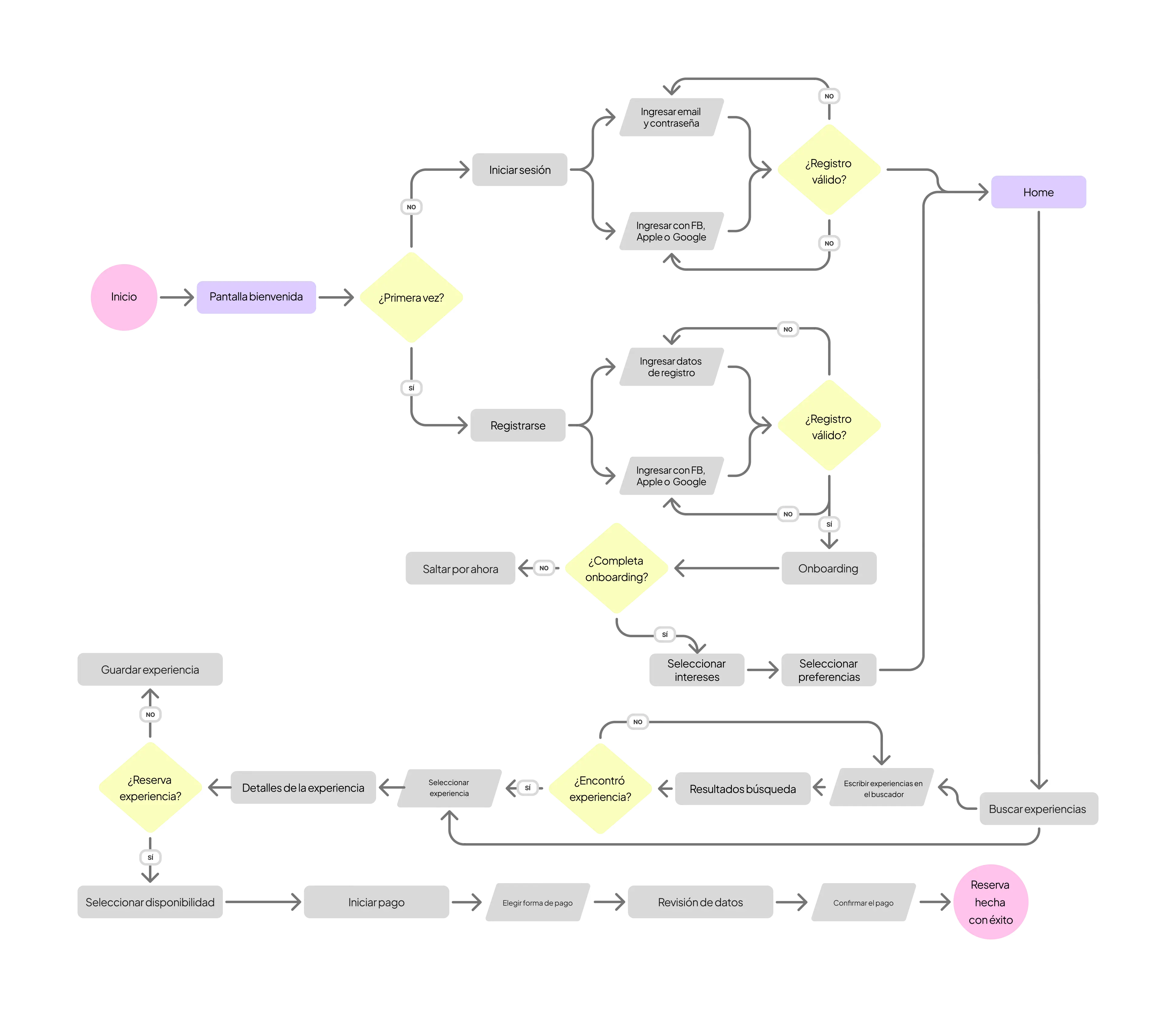
- User Personas and User Journeys.
- User flows for exploration, details, and booking.
- Information Architecture (IA) to organize categories and experiences.
- Prioritization of core features.
3. Design
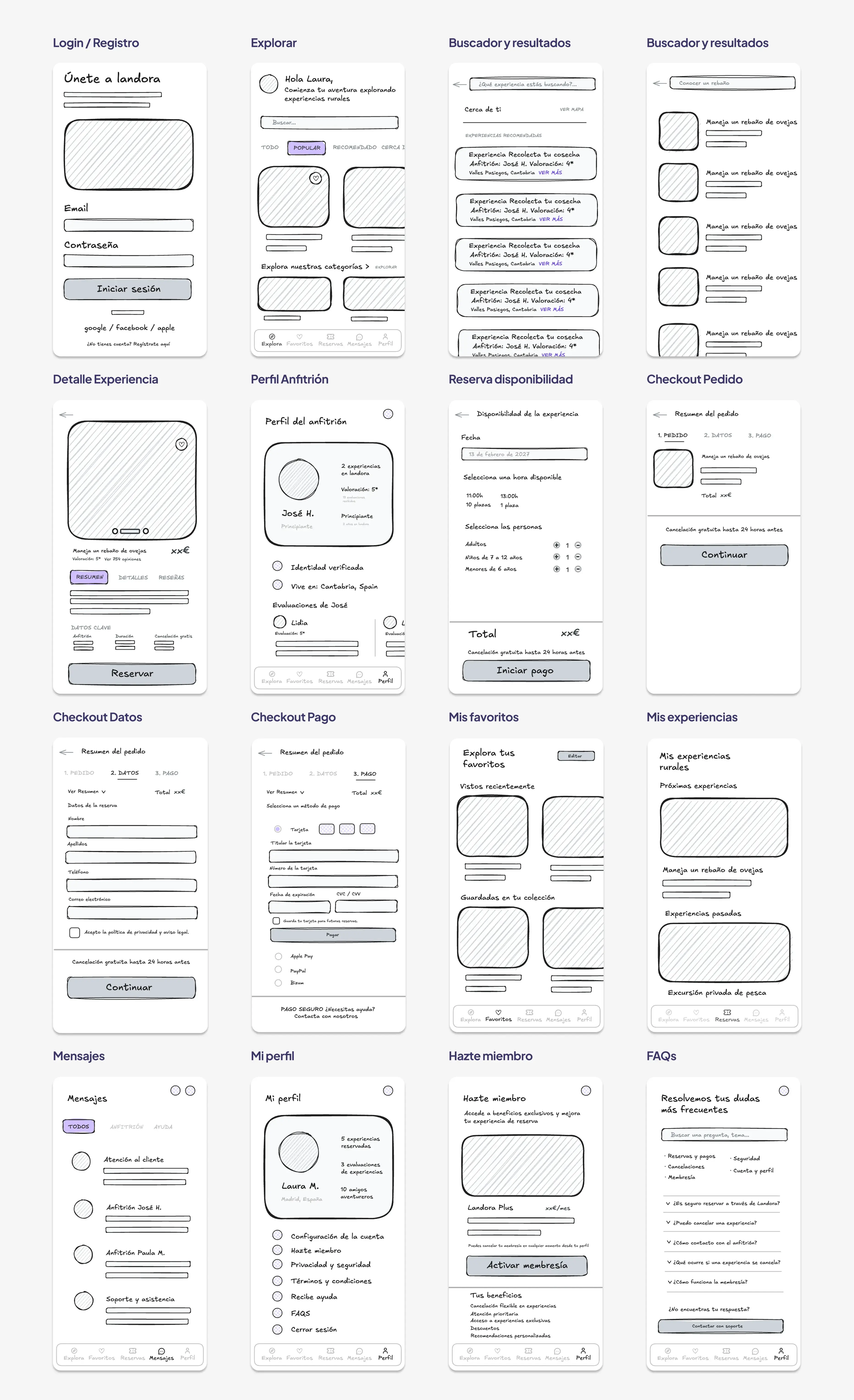
The process began with low-fidelity wireframes to validate the structure before investing in the visual system. Once the architecture and flows were validated, interactive prototypes were developed in Figma, and the visual system was built on three pillars: clarity, hierarchy, and accessibility.
- Low-fidelity wireframes to validate structure.
- Interactive prototypes in Figma.
- Visual system based on clarity, hierarchy, and accessibility.
Design Decisions
Purple was chosen over green because it's more distinctive and aligns with the user's motivation of escaping routine and seeking meaningful experiences.
The original purple did not meet WCAG 2.1 AA (minimum 4.5:1 ratio), verified via Figma plugin. The original purple was reserved for decorative branding, and the primary lilac ramp was calibrated to level 600 for all interactive elements, meeting the 4.5:1 ratio for all text and interaction use cases.
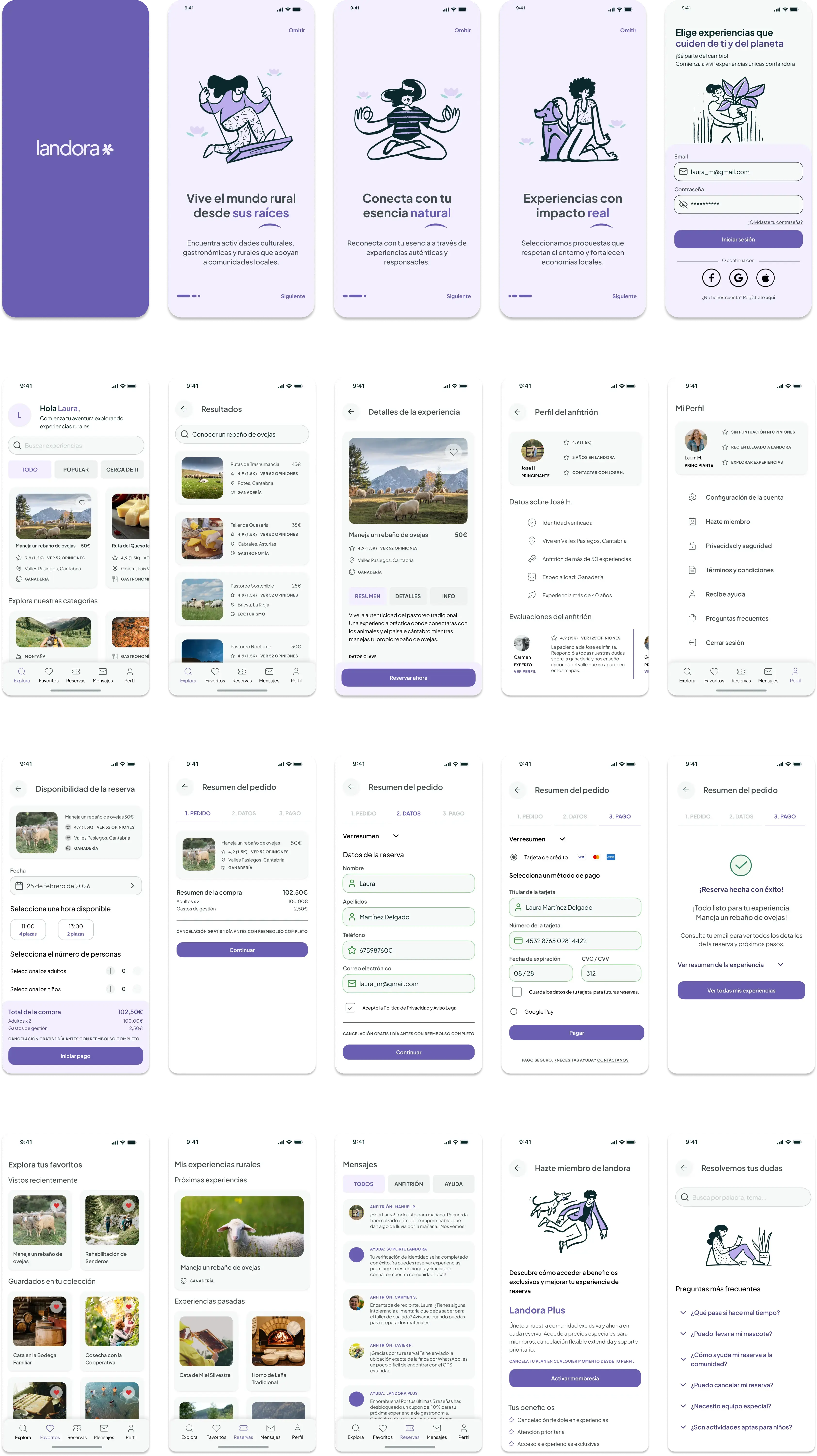
- Pre-checkout screen: date, time, and guest selection with real-time cost visualization.
- 3-step checkout: order summary, personal details, and payment.
- Activity information remains visible throughout the entire process.
- Cancellation policy and support notice included at the payment step.
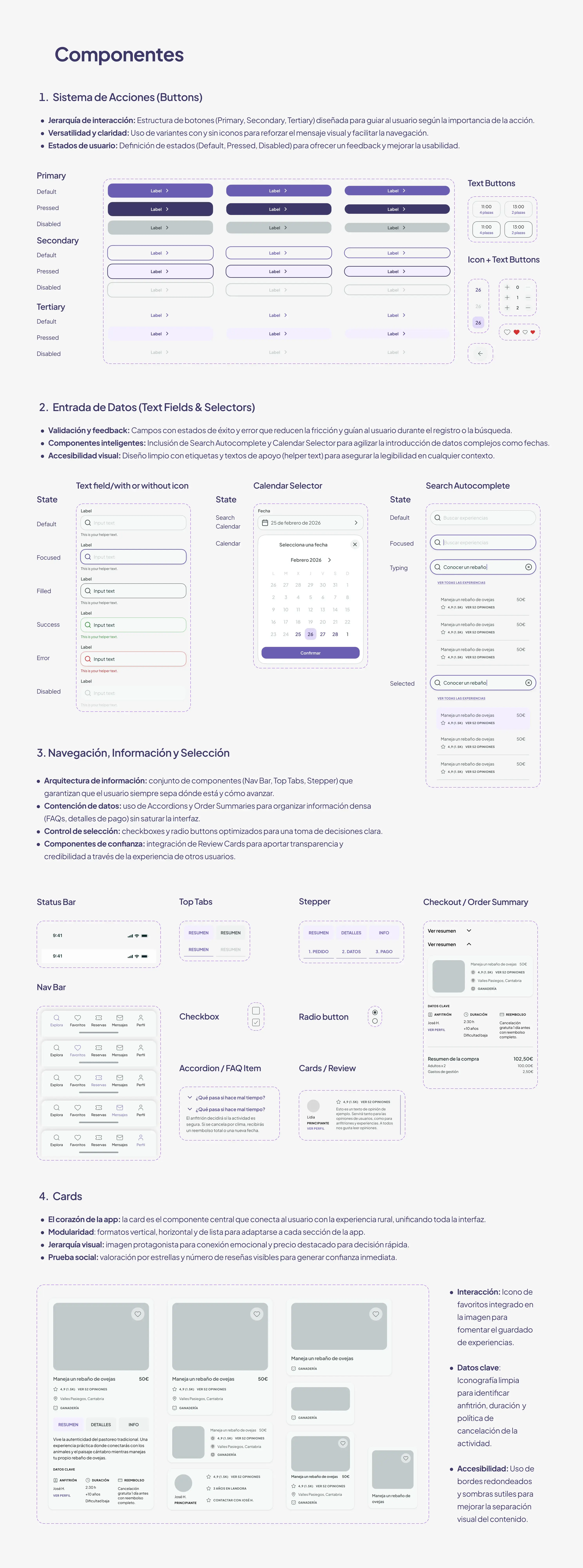
- Component library published in Figma as an independent library, separate from the screen layout file.
- Token architecture structured in two layers, primitive values and semantic aliases, covering color, typography, spacing, padding, radius, and grid.
- Accessible color palette, verified against WCAG 2.1 AA contrast standards.
- 20+ components: buttons, text fields, calendar selector, nav bar, cards, stepper, checkout summary, and modular cards.
- Fully documented for developer handoff, audited for consistency and published as a standalone documentation site.
| Identified Problem | Design Decision | Expected Impact |
|---|---|---|
| Overly complex booking process | 1 configuration screen + 3-step checkout with persistent info | Reduced friction and abandonment rates |
| Lack of reliable visual info | Booking card with swipeable gallery + verified reviews | Increased user trust before confirmation |
| Fragmented search experience | Centralized platform with clear category-based browsing | Reduced search time and improved task completion |
| Purple brand color didn't meet WCAG 2.1 AA | Separated brand color from interaction color, calibrated level 600 lilac primary ramp | Full accessibility without sacrificing visual identity |
Handoff & DS Documentation
Beyond the interface design, I treated Landora's UI kit as a system meant to be handed off, not just a set of screens. That meant auditing every token for consistency, structuring a two-layer token architecture, and documenting accessibility compliance before calling it done.
Color was already defined as Figma Styles, but spacing, padding, radius, and typography weren't yet structured as reusable tokens. I converted the color styles to Variables, then built the remaining scales from scratch.
Rather than inventing an arbitrary scale, I scanned actual usage across the component library to see what values were already in play, surfacing a clear core pattern in spacing and padding (4, 8, 12, 16, 24, 32, 64) alongside dozens of one-off values that didn't belong. That core pattern became the primitive scale.
Before generating any handoff documentation, I ran a token audit across the full component library rather than trusting it was already consistent. The audit surfaced real inconsistencies: 213 spacing and padding values, a 6px and 10px pattern, and corner radius outliers.
Instead of documenting the system as it stood, I used the audit to enforce a clean 4px-based scale, resolving each outlier by context rather than blindly rounding to the nearest value. For example, a tab bar container's radius (20px) was raised to 24px to match its larger surface area, keeping it visually distinct from smaller interactive elements at 8px. Decorative elements outside the actual design system, like a mockup's status bar battery icon, were deliberately excluded from the token scale rather than forced into it.
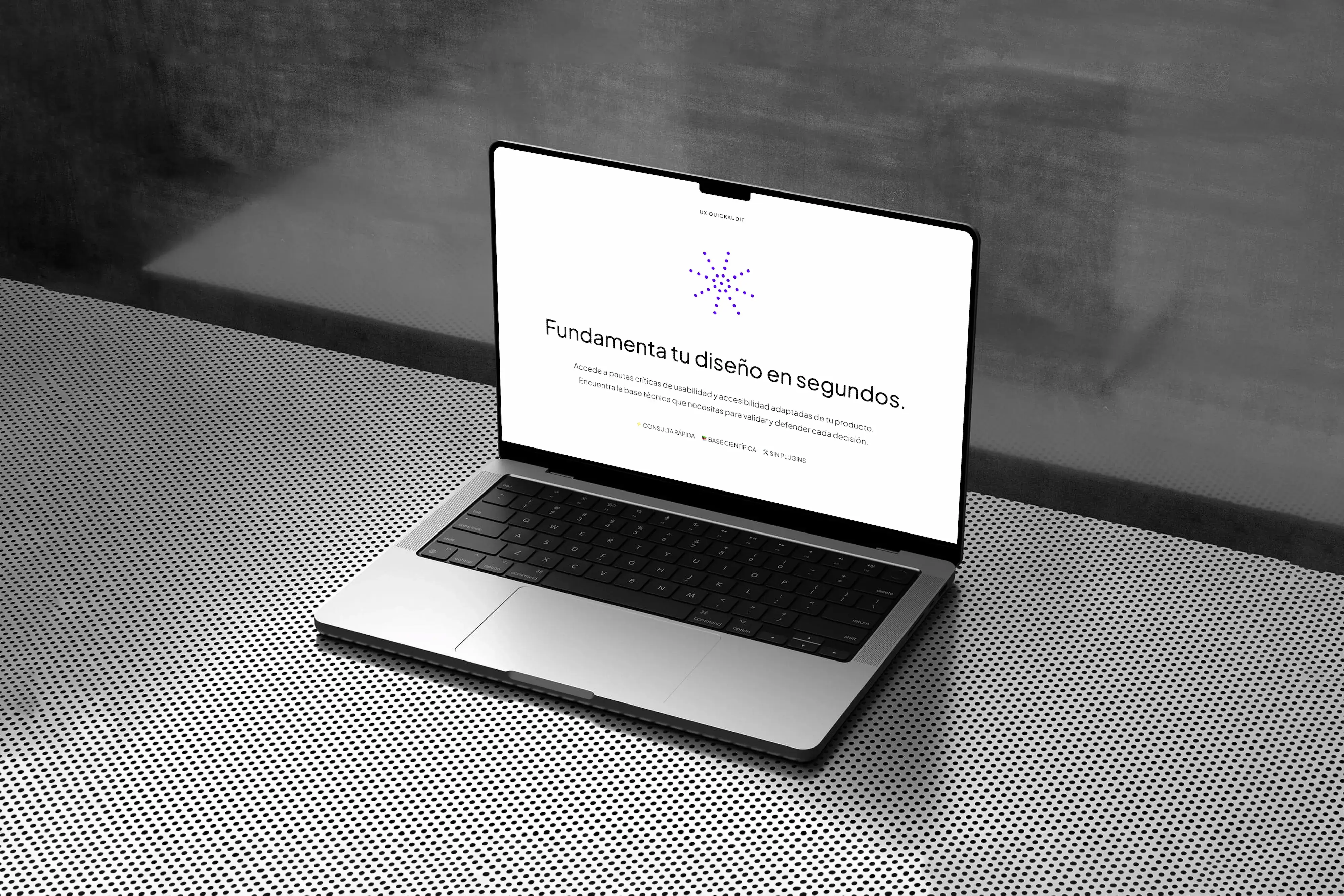
With tokens and components audited and cleanly named, I generated a standalone documentation site in Zeroheight, covering foundations (color, typography, spacing, padding, radius), component specs (anatomy, variants, states), and accessibility guidelines, built directly from the Figma file for accurate developer handoff.
a) Key Deliverables
The final design delivers a cohesive digital solution combining a solid visual system with a clear, accessible booking experience. Through a streamlined flow and design decisions justified by real research, Landora offers users a trustworthy platform to manage bookings with minimal cognitive effort, backed by a fully documented, production-ready design system with primitive and semantic tokens, ready for developer handoff.
b) Design Learnings
Consistency isn't something you get right by construction: it erodes through hundreds of small manual adjustments, even in a careful process. Auditing the token system after the fact, rather than assuming it was clean, surfaced real inconsistencies I wouldn't have caught otherwise. And not every irregular value is a mistake to fix: distinguishing a legitimate design decision (a larger radius on a bigger surface) from actual drift (a decimal value from resizing by hand) required judgment, not just automation.
c) Next Steps
If the product were developed beyond the prototype, the following improvements would be explored:
- Conduct usability testing with real users to validate booking flows and uncover undetected friction points in the design process.
- Extend the semantic token layer to cover elevation and motion (shadows, transition timing), completing the system beyond color, spacing, and typography.
- Develop the native mobile version, prioritizing quick booking flows and active reservation management.
Outcome
Identified a real market opportunity: no existing platform combines high-quality UX with a rural focus and community support. Simplified the booking process to 1 configuration screen + 3 checkout steps with persistent contextual information. Accessible color system: level 600 primary lilac ramp to comply with WCAG 2.1 AA (> 4.5:1 ratio). UI Kit documented as a production-ready design system, 20+ components, primitive and semantic tokens, audited for consistency and published as a standalone handoff library. Fully testable interactive prototype in Figma.